Two years of UX research, moderated user studies, and design-system work across 120+ automotive dealership websites — turning data into measurable conversion gains.
Role
UX Designer & Researcher
Year
2022–2024
Industry
Automotive
Type
UX Research / Design Systems
The Challenge
120 websites. Zero consistency.
AAG / AMSI Group managed over 120 automotive dealership websites across multiple platform providers — Dealer.com, Dealer Inspire, DealerEprocess, and DealerON. Each vendor had its own patterns, component libraries, and CTA logic, making cross-site optimisation nearly impossible.
Beyond the design fragmentation, there was no structured process for measuring UX decisions against real sales outcomes. Decisions were made by gut feel, not evidence. My job was to build the research infrastructure and the design system to change that.
The Work
Research first, then build.
Planned and conducted moderated usability studies on high-traffic pages — homepages, VDPs, service pages — identifying friction points across device types
Developed vendor-specific UX Playbooks for all four platform providers, giving the in-house team repeatable, evidence-based standards
Ran A/B and multivariate CTA copy tests across homepage, VDP, and service pages, informing standardised CTA patterns used network-wide
Led the Live Chat FAB study — evaluating placement, sizing, and timing for real-time messaging across 60+ dealerships
Built the email hero design system used across dealership newsletters and seasonal promotions
Collaborated with 4 vendor engineering teams to ship standardised navigation, homepage model bars, and search widgets
The Results
What moved.
76%
Chat-to-lead conversion across the dealer network
3.05%
Visit/click CDR — vs 0.36% national benchmark (8.5× above average)
120+
Dealership websites standardised under the new UX system
In Their Words
"Ellen brought a research discipline our team didn't have before. She turned scattered hunches into a system we could actually measure — and the numbers followed."
— Marketing Director, AAG / AMSI Group
The Full Story · 4 Work Streams
Four avenues, one engagement.
Across two years with AAG / AMSI I worked on four distinct streams — research, optimization, systems, and production design. The full methodology, findings, and screens are password-protected out of respect for client confidentiality.
🔒
Protected case study
The full work — moderated research, the live-chat audit & standards, the multi-brand design system, and the email production system — is password-protected. Reach out and I'll happily share the password.
A short, high-signal moderated study measuring user satisfaction across key shopping flows — turning feelings into an evidence-based, prioritized backlog.
Overview & Setup
Evaluating satisfaction & usability.
Overview & Context
Two dealership sites on two CMS platforms (of four) had accumulated competing widgets and dense content. I ran a short, high-signal moderated study to measure user satisfaction across key shopping flows and identify specific areas needing improvement — without breaking existing templates.
Problem Statement
Shoppers arrived with intent but hit auto-opening chat popups, busy banner mosaics, opaque pricing terms, and mobile legibility issues. These patterns risked eroding satisfaction and slowing progress to core actions — browse, compare, finance, contact.
Goals & Success
Primary: quantify user satisfaction per flow and expose friction points to fix next.
Secondary: validate findability and predictability of help (chat), improve pricing comprehension, and reduce interruptions.
Success looks like: higher satisfaction ratings, a clearer preferred path to financing, and a prioritized low-effort backlog mapped to measured pain points.
Timeline: ~3 weeks; 10 moderated sessions across desktop & mobile.
Constraints: work within existing CMS templates and brand rules; focus on low-effort, high-impact changes first; mobile stays first-class.
Methodology
How it was run.
Approach
Moderated usability testing with in-flow satisfaction checks, qualitative probing, and a heuristic review (readability, hierarchy, motion). Pairing observable behavior with self-reported satisfaction let me quantify how it felt and diagnose why.
Participants & Tasks
In-market car shoppers across luxury and non-luxury segments. Core tasks: homepage triage → SRP/VDP comprehension → pricing understanding → financing entry → contact options.
Measures
Satisfaction ratings per flow (accessibility of information, ease of navigation), plus behavioral signals — first-clicks, hesitation points, pop-up dismissals, mobile mis-taps — comprehension probes, and short verbatims tied to each issue.
Key Findings
What users told us.
Placement gravity — users expect chat bottom-right as a persistent launcher, not an auto-popup
Entry clarity — two chat buttons ("Chat" + "Text Us") split attention; one entry with a mode choice after click was preferred
Motion fatigue — a looping bounce grabbed attention and drew complaints; a one-time nudge is enough
Pricing comprehension — inline definitions for sticker vs. final price improved clarity
Mobile readability — busy backgrounds and small targets hid primary CTAs; users missed or mis-tapped them
"I just want to know the price without filling out a whole form first."
"There are two different chat buttons — which one actually reaches a person?"
Design Decisions & Rationale
What changed, and why.
Chat Behavior
No auto-open. Persistent launcher bottom-right, one invite max, respect dismiss → lowers interruption.
Entry Model
A single launcher; choose chat or text after the click. Reduces clutter and speeds the decision.
Banner Rhythm
Fewer tiles, one CTA per pod, consistent spacing → improves scanability.
Pricing Clarity
Inline price definitions and a single-page financing calculator → less hopping, higher comprehension.
Readability & Fitts' Law
Calmer backgrounds, stronger contrast, and ≥44–60px tap targets on mobile → fewer mis-taps.
Impact & Reflection
What moved.
Information accessibility: rated 5/5 in post-task satisfaction
Ease of navigation: 4.5/5 — exceeded expectations
Financing path: "Customize Payment" emerged as the trusted entry point
Tracking plan: first-click to launcher, visitors→chat, chat→lead, response time, popup-complaint rate
Lessons learned: small tweaks, big change — where chat lives, when it appears, and the words we use made the whole journey feel calmer. We shipped guardrails, not a remodel: a few clear rules inside the existing templates delivered value fast. And when we measured satisfaction and clarity, the right decisions revealed themselves — clicks alone didn't tell the story.
02
Optimization & Standards
Live Chat Optimization
A cross-site audit of 120+ dealership websites and four chat providers — authoring the business rules and UI standards that unified a chaotic surface.
Overview & Context
Best practices for a first-class chat experience.
Overview & Context
I led the research and cross-site audit to unify live chat across 120+ dealership websites and four chat providers, then authored the business rules & UI standards and presented them to stakeholders for adoption.
Problem Statement
Inconsistent placement and behavior created confusion and irritation — chat popping on load, floating in odd corners, competing with other buttons. UI sprawl across providers made the surface noisy (sizes, colors, labels, animations). I needed to replace guesswork with evidence and guardrails teams could implement quickly.
Goals & Success
Measure user satisfaction with live chat (buttons + popups) and pinpoint improvement areas.
Produce cross-provider standards — placement, frequency, size, color/typography, animation, copy.
Keep or improve engagement and lead quality while cutting irritation and visual noise.
Timeline: 12-week program; constraints included OEM brand rules, CMS limitations, and provider differences — guardrails had to fit every provider without a redesign.
Method & Audit
What the audit uncovered.
Methodology
Unmoderated usability testing — 12 desktop + 12 mobile, real tasks on two live dealership sites — collecting behavior and satisfaction per flow to tie feelings to evidence.
Ecosystem audit of 120+ sites across 4 providers; captured screenshots, sizes, copy, and placements across every provider variant to map patterns and outliers.
KPI readout with ops — visitors→chat, chat→lead, missed chats, first response, and resolution time — to ensure the new rules wouldn't harm operational outcomes.
Key Challenges
Placement confusion (top/left placements, inconsistent popups) made users hunt instead of act. Button overload — "Chat," "Text Us," and non-chat CTAs crowded the surface. Inconsistent sizing/branding across providers and OEMs. Irritating looping-bounce motion.
What I Found
Placement: users expect chat bottom-right as a persistent launcher; alt placements felt unintuitive.
Buttons: one entry point, with chat-vs-text chosen after click, reduces clutter and speeds decisions.
Popups: a delayed invite (~15s) and no page-load auto-open; once closed, stay closed.
Size & targets: small buttons (~38×114px) felt too small; ≥44–60px height with generous padding (Fitts's Law).
Color & type: 16px base text, 1.4–1.6 line height, sans-serif; hues tuned to brand.
Motion: one subtle entrance only — looping bounces removed; irritation outweighed the benefit.
Business Rules I Wrote
Guardrails, not a redesign.
Placement & Behavior
Persistent launcher bottom-right on every page. Invite popup anchored just above it; ~15s delay; one invite per session; respect dismiss.
No auto-open on page load; avoid floating/looping animations.
Surface & Copy
One entry on the surface → choose chat/text after click. Remove non-chat actions from the cluster.
Labels in clear sentence case; no ambiguous icons alone.
Brand-aligned colors with clear primary/secondary differentiation; 16px base type, 1.4–1.6 line height.
Shipped First
Placement & timing guardrails, consolidated entry, a sizing/readability spec, and per-provider "done means done" checklists to standardize execution and prevent regressions.
Impact
Satisfaction: participants described the experience as easy, smooth, accessible.
Ratings: information 5/5, navigation 4.5/5; "Customize Payment" preferred for financing.
Adoption: delivered a stakeholder deck and standards pack so product and vendor teams could roll out changes across 120+ sites with minimal rework.
03
Systems
The Design System
A unified, multi-brand design system — core foundations plus 30 OEM subsystems — that became one source of truth for design and development.
Overview & Context
One source of truth across 130+ sites.
Overview & Context
Led the creation of a unified design system teams could actually use. Started by mapping the real ecosystem — 130+ dealership sites on 6 CMSs across 30+ OEM brands — then built a core system with brand-specific subsystems to move fast without losing identity.
Problem Statement
Inconsistent experiences and long cycles. With many hands and changing OEM guidelines, patterns, naming, and execution drifted — no single source of truth for design, dev, or third parties. I framed it as a cohesion + speed problem a system could solve.
Objectives
Create one source of truth for design + development — cut time-to-market, reduce errors, raise consistency/UX quality.
Enable non-designers to prototype with approved building blocks; free designers for higher-leverage work.
Improve collaboration across UX, product, and dev via shared tokens, components, and docs.
Landscape
CMS mix spanned DDC (~55%), DealerOn (~23%), DealerInspire (~12%), Dealer eProcess (~5%) and a long tail — used to plan where standards would land first. 30+ OEM brands, each with different rules.
Method & Architecture
Core + subsystems.
Methodology
Interviews + process mapping with designers, devs, AEs, and stakeholders to understand handoffs and where work slipped off brand.
Inventory + audit of typography, color, spacing, controls, states, and repeated modules — documenting duplication and drift.
Industry calibration — reviewed Polaris, Carbon, Material, and Lightning to right-size the approach for a multi-brand, multi-CMS world.
Architecture
Core + subsystems: a core DS (foundations + base components) plus 30 brand subsystems for OEM-specific elements, so teams compose pages quickly without reinventing.
Atomic hierarchy: atoms → components → blocks/organisms → sections → templates → libraries, each with states, sizes, and properties documented in Figma.
Token strategy: separated core tokens (color, type, spacing, radius, elevation, motion) from semantic tokens to theme across OEMs without changing component logic.
Scale
The kit grew to 1,300+ components and 1,000+ styles, with brand subsystems for Porsche, Ford, Nissan, Subaru, Volvo, BMW, Mazda, Infiniti, Hyundai and more — all driven from the shared core.
04
Production Design
Email Production
A repeatable email-hero design system powering dealership newsletters and seasonal campaigns across the network — high volume, on-brand, fast turnaround.
Overview & Context
Seasonal heroes at scale.
The Work
Designed and produced animated email heroes and promotional layouts for dealership newsletters and seasonal pushes (summer savings, holiday, model-year-end). Built reusable templates so campaigns could ship quickly while staying on-brand per OEM.
System Approach
Reusable hero templates — consistent layout, type scale, and CTA structure that drop into any dealership's brand.
Motion with restraint — subtle animated GIF heroes that catch the eye without overwhelming the inbox.
Volume-ready — a kit that let one designer turn around many campaigns across many brands.
Result
A library of seasonal email creative used across the dealer network — faster production, consistent quality, and a recognizable promotional voice.
Selected Work
The email system.
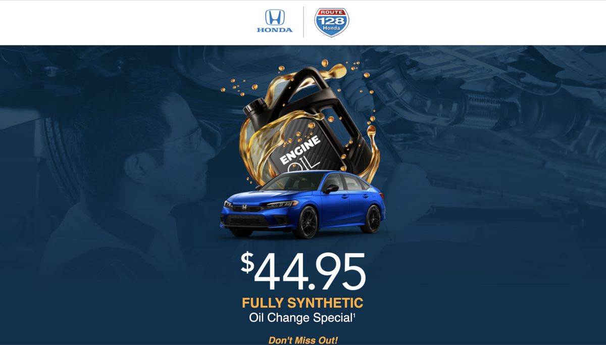
A sample of the animated email heroes and seasonal campaign layouts produced for the dealership network.